Covid-19 New Cases and Deaths
Covid-19 new cases and deaths line and area chart. The graph is linked to...
The dashboard visualizes alcohol consumption vs students class attandance and...
Charts Gallery
Visualizing exchange rates of GEL, USD, TRY through time. I’ve visualized...
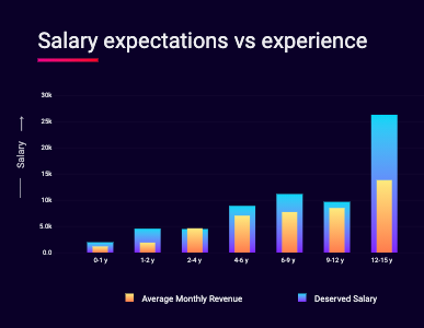
Update visualization based on the work type of respodents. I’ve visualize...
Overlapping vizualization of responses. I’ve grouped data based on the exp...
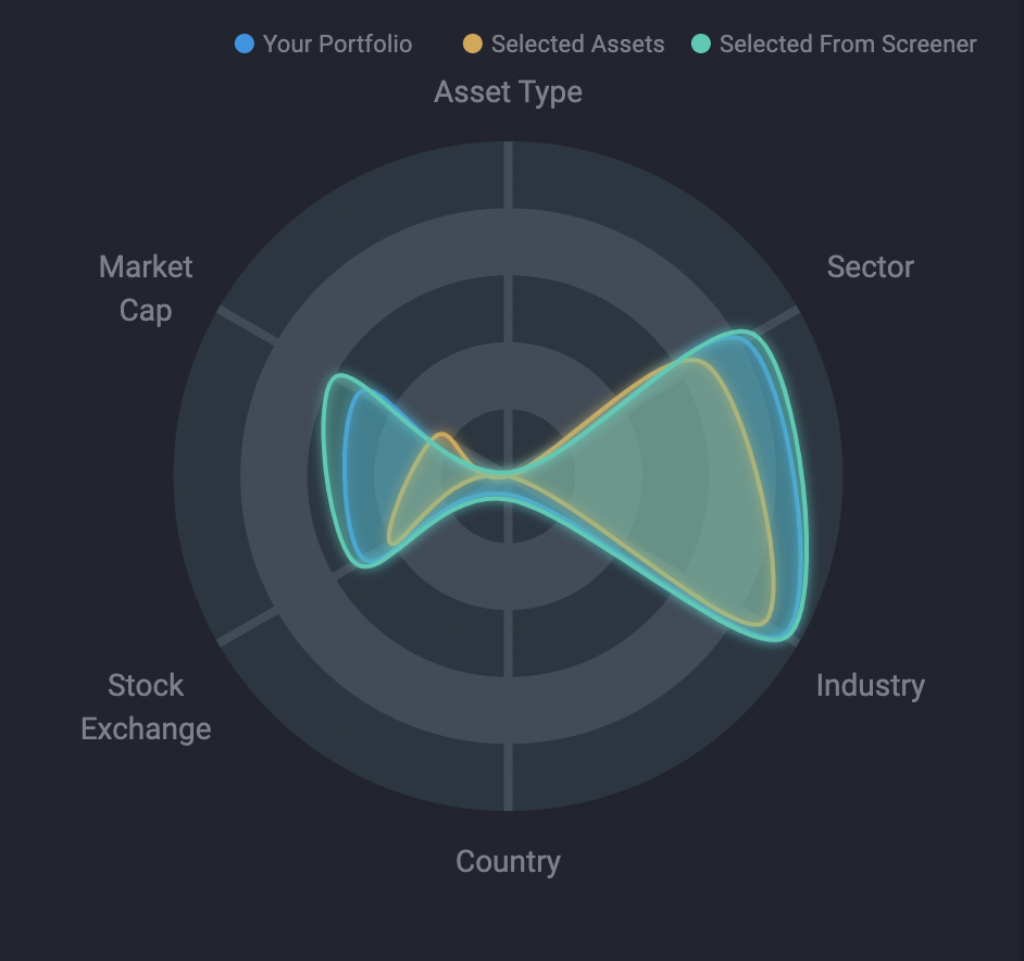
An interactive D3.js visualization of org structures — circles, roles, and pr...
The dashboard visualizes alcohol consumption vs students class attandance and...
Built ETF Insider App — an interactive web app that visualizes ETF and mutual...
Built an interactive data visualization platform for Bupa from the ground up,...
Developed CompTIA’s Career Explorer — an interactive quiz and data platform m...
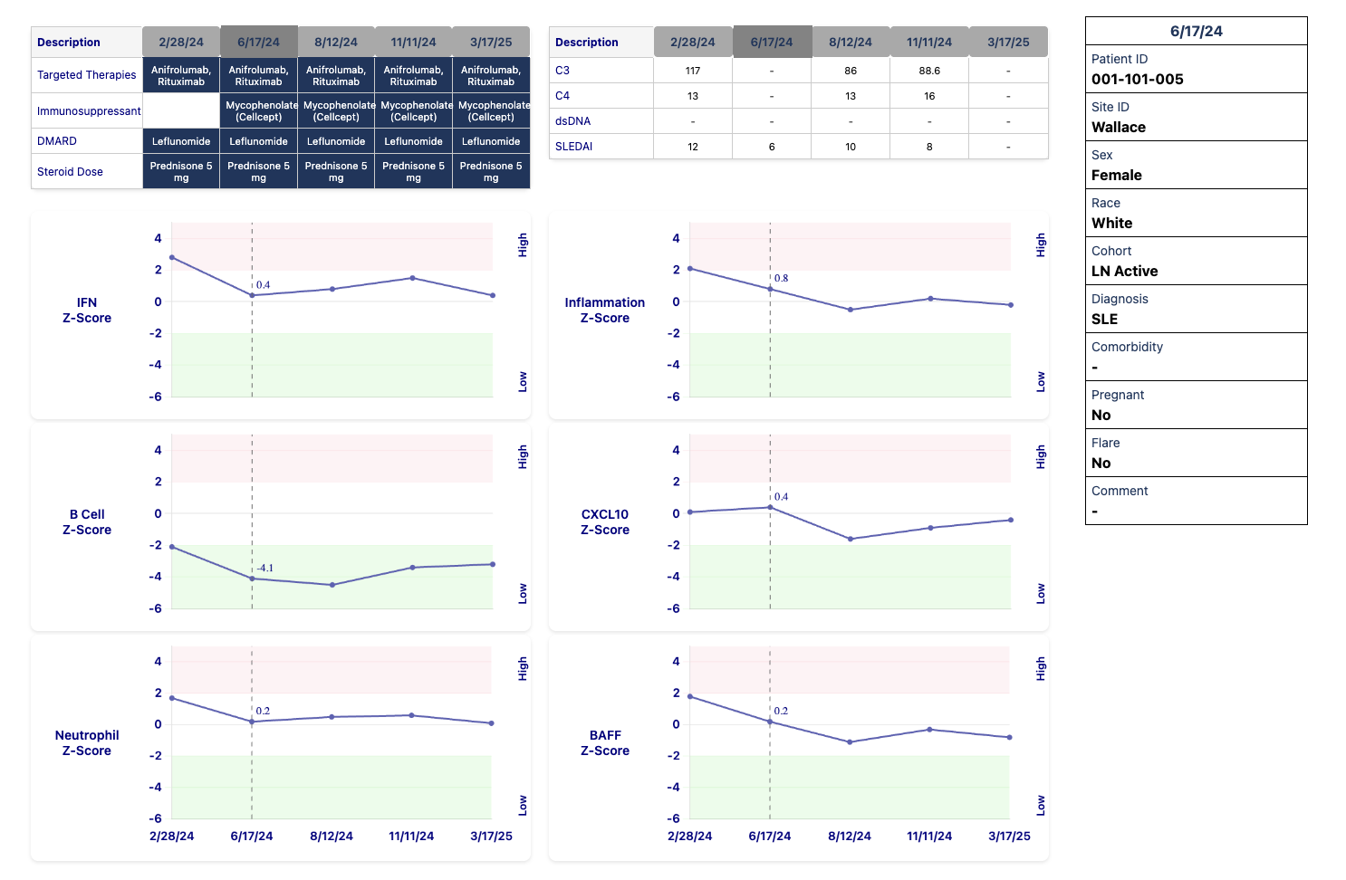
The dashboard visualizes treatment and its outcomes of the selected patient o...
The dashboard visualizes alcohol consumption vs students class attandance and...
Website prototype with several pages and data visualization dashboards. ...
Central banks and stock exchange points worldwide Central banks and stock...
Built Where You Work Matters — an independent rating platform (a Mastercard F...
Charts Gallery
Dashboard with map, filters and informative panels ...
Central banks and stock exchange points worldwide Central banks and stock...
3D globe is a good way to visualize international data. The globe can b...
The entries in the table can be sorted according to the different criteria, r...
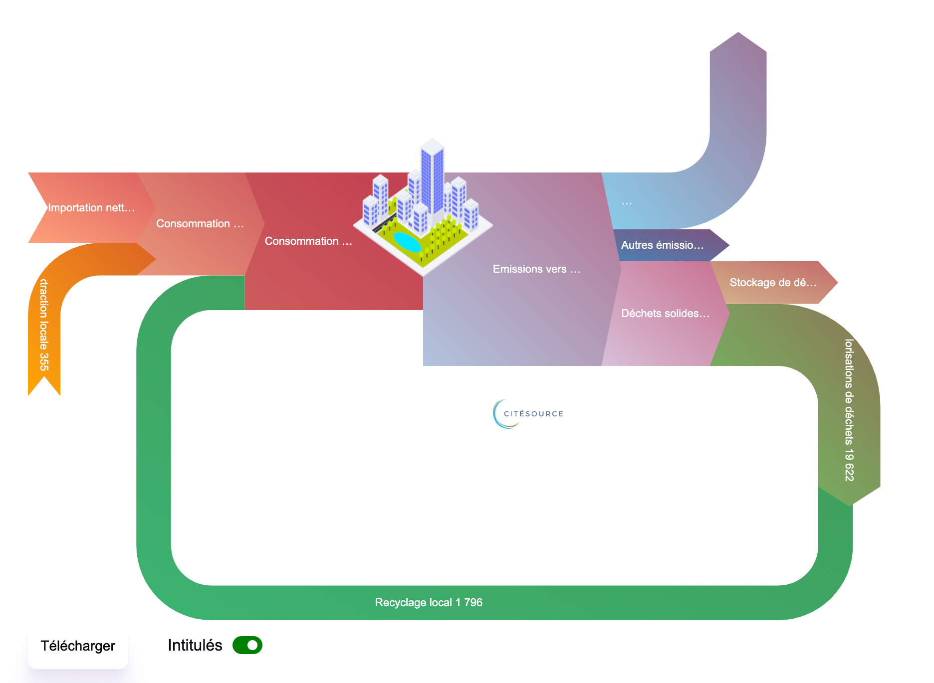
Circular economy sankey visuzlizes diractional flows of the materials as in...
Sankey chart visualizes flows among different nodes. The clicked nodes an...
Covid-19 new cases and deaths line and area chart. The graph is linked to...
Visualizing exchange rates of GEL, USD, TRY through time. I’ve visualized...
Update visualization based on the work type of respodents. I’ve visualize...
Overlapping vizualization of responses. I’ve grouped data based on the exp...
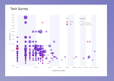
Visualizing responses through time. I’ve visualized Tech Survey 2020 respo...
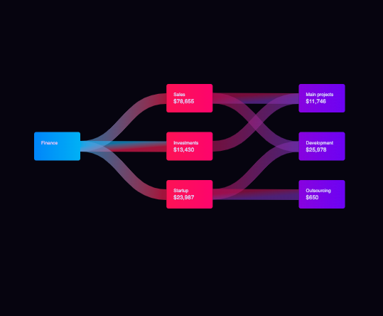
Beautiful sankey diagram with carefully chosen colors is a great way of visua...
An interactive D3.js data visualization exploring life expectancy across U.S....
Built ETF Insider App — an interactive web app that visualizes ETF and mutual...
Website prototype with several pages and data visualization dashboards. ...
Central banks and stock exchange points worldwide Central banks and stock...
Central banks and stock exchange points worldwide Central banks and stock...
Covid-19 new cases and deaths line and area chart. The graph is linked to...
Visualizing exchange rates of GEL, USD, TRY through time. I’ve visualized...
Update visualization based on the work type of respodents. I’ve visualize...
Overlapping vizualization of responses. I’ve grouped data based on the exp...
Beautiful sankey diagram with carefully chosen colors is a great way of visua...
Built an interactive dashboard tracking the New World Screwworm outbreak for ...
The dashboard visualizes alcohol consumption vs students class attandance and...
Built an interactive data visualization platform for Bupa from the ground up,...
The dashboard visualizes treatment and its outcomes of the selected patient o...
The dashboard visualizes alcohol consumption vs students class attandance and...
An interactive D3.js visualization of org structures — circles, roles, and pr...
Built an interactive dashboard tracking the New World Screwworm outbreak for ...
The dashboard visualizes alcohol consumption vs students class attandance and...
Built an interactive data visualization platform for Bupa from the ground up,...
Developed CompTIA’s Career Explorer — an interactive quiz and data platform m...
The dashboard visualizes treatment and its outcomes of the selected patient o...
The dashboard visualizes alcohol consumption vs students class attandance and...
Built Where You Work Matters — an independent rating platform (a Mastercard F...
Dashboard with map, filters and informative panels ...
3D globe is a good way to visualize international data. The globe can b...
The entries in the table can be sorted according to the different criteria, r...
Circular economy sankey visuzlizes diractional flows of the materials as in...
Sankey chart visualizes flows among different nodes. The clicked nodes an...
Visualizing responses through time. I’ve visualized Tech Survey 2020 respo...
The dashboard visualizes alcohol consumption vs students class attandance and...
The dashboard visualizes treatment and its outcomes of the selected patient o...
The dashboard visualizes alcohol consumption vs students class attandance and...
Charts Gallery
Covid-19 new cases and deaths line and area chart. The graph is linked to...
Charts Gallery
Circular economy sankey visuzlizes diractional flows of the materials as in...
Sankey chart visualizes flows among different nodes. The clicked nodes an...
Beautiful sankey diagram with carefully chosen colors is a great way of visua...
Visualizing responses through time. I’ve visualized Tech Survey 2020 respo...